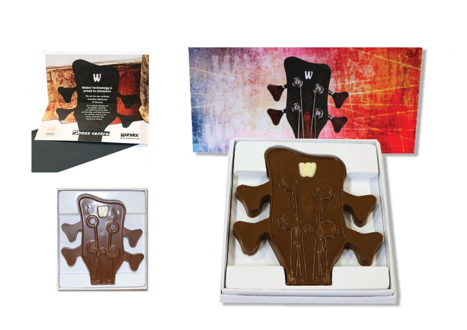
To announce the acquisition of Warwick, a new brand of guitars, I designed a chocolate mould of the distinct guitar head with the W and sent to each dealer with a personalised card with their logo. They were very impressed! Think outside the box!

To announce the acquisition of Warwick, a new brand of guitars, I designed a chocolate mould of the distinct guitar head with the W and sent to each dealer with a personalised card with their logo. They were very impressed! Think outside the box!

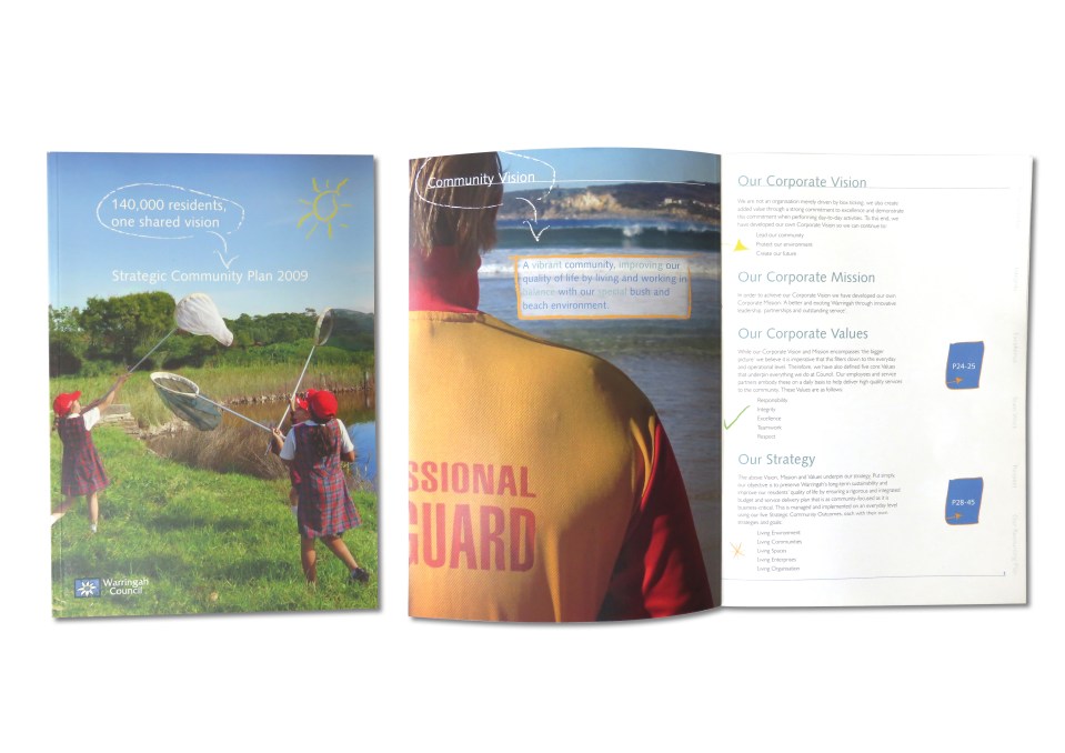
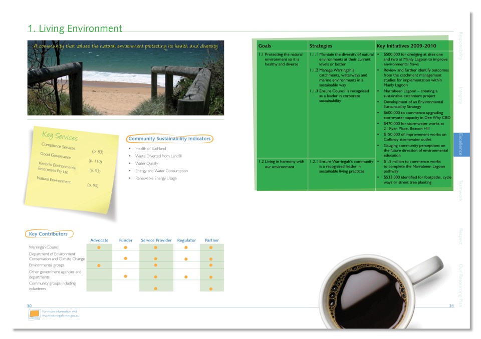
The strategic community plan is an annual document outlining council’s plan for the community. The theme: a plan the council and community work on together, it is a work in progress. The design reflects this by having hand drawn arrows and highlights, post it notes, coffee cups, markers and coffee stains. A real ‘working’ document.
I have other examples of strategic plans upon request.

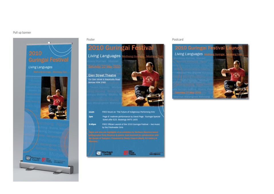
The Guringai Festival was an annual event highlighting indigenous culture on the northern beaches. The theme was Living Languages. I chose to repeat and overlap aboriginal words, bringing them to life, as a design.

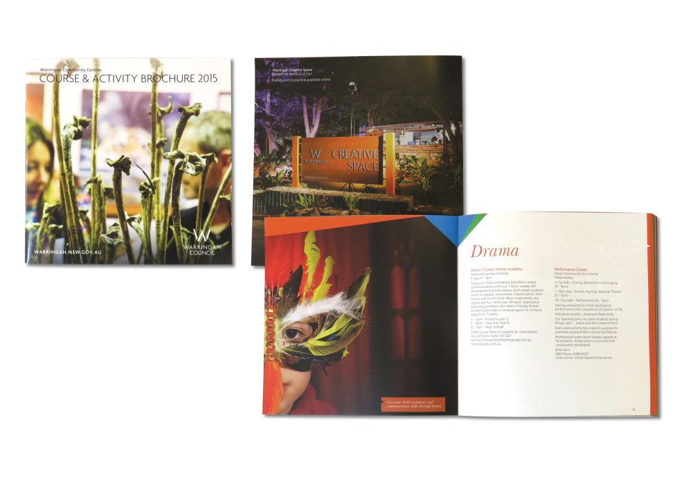
This is an annual brochure combining information of all the community centres in the Warringah Council LGA. Full page hero imagery and simple typography make the text heavy brochure easy to read.

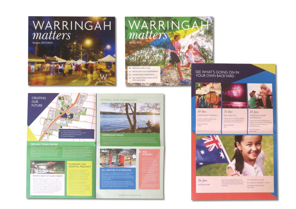
Quarterly newsletter distributed to all residents. I handled design and distribution with the mail house. The trick was to gather content from different departments, and make sure it hit the mailboxes on the required date. Recycled uncoated stock was used.

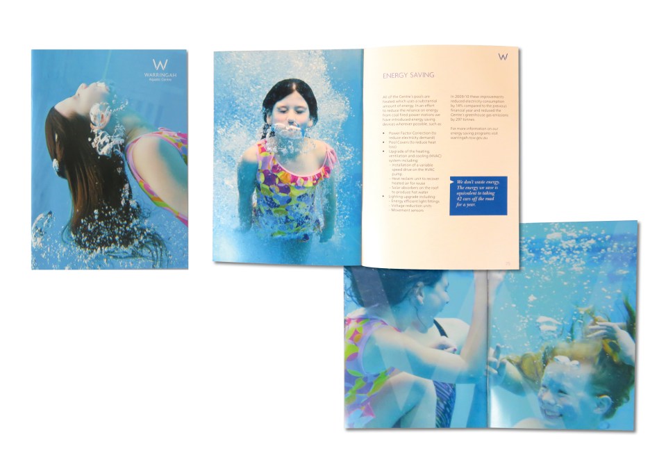
This brochure outlines the Warringah Aquatic Centre’s services and was updated annually. The design and typography is clean and simple focusing on the hero shots.
